What a Liberty forecast looks like.

Liberty doesn’t protect you from volatility — it protects you from poor decisions.

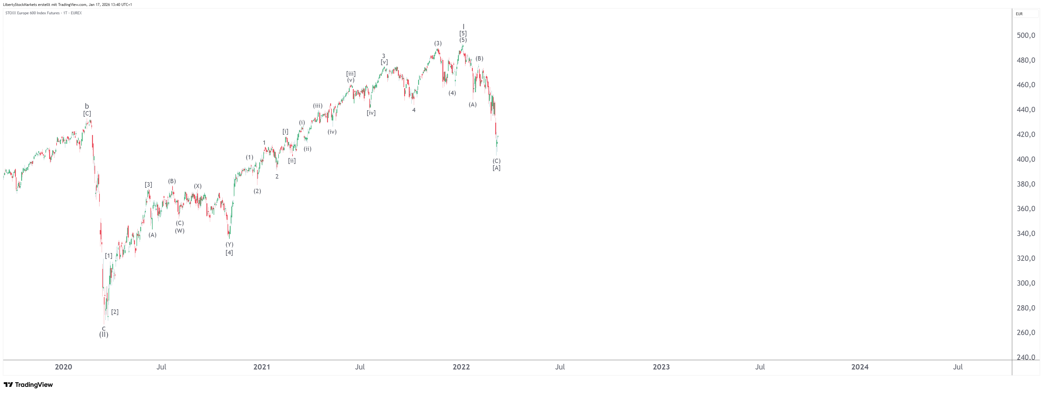
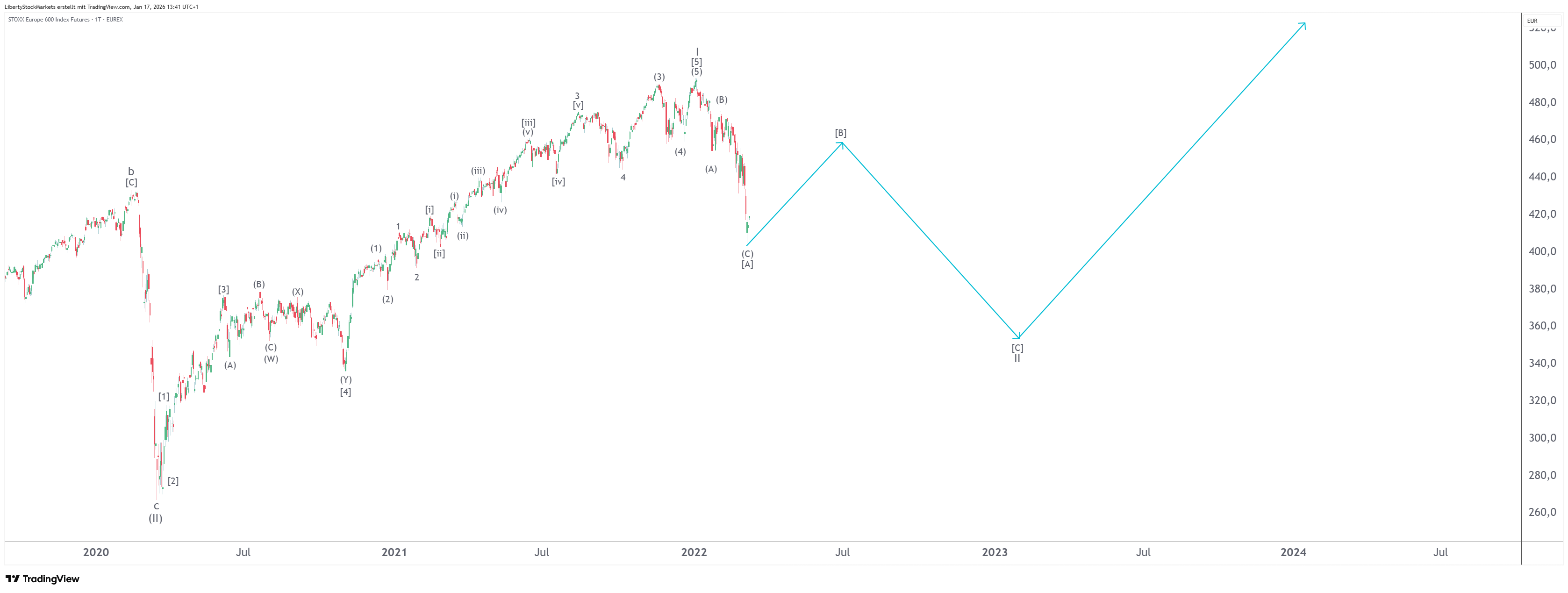
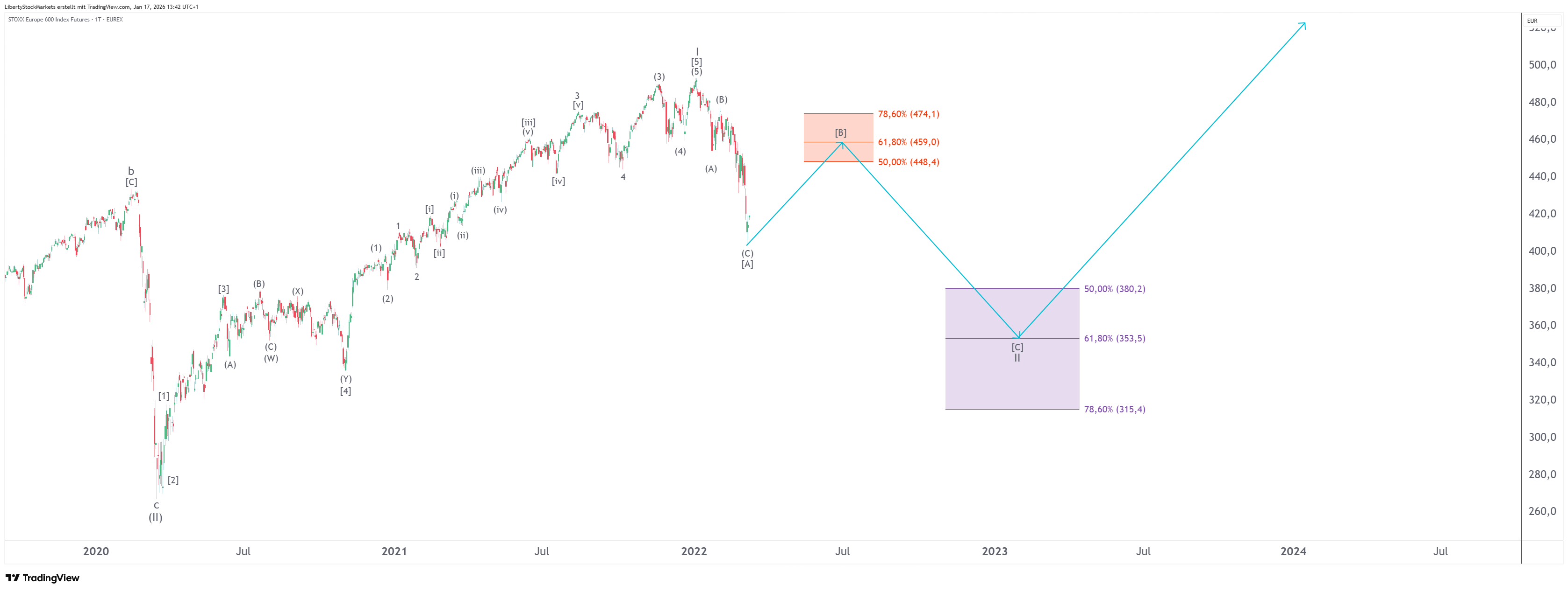
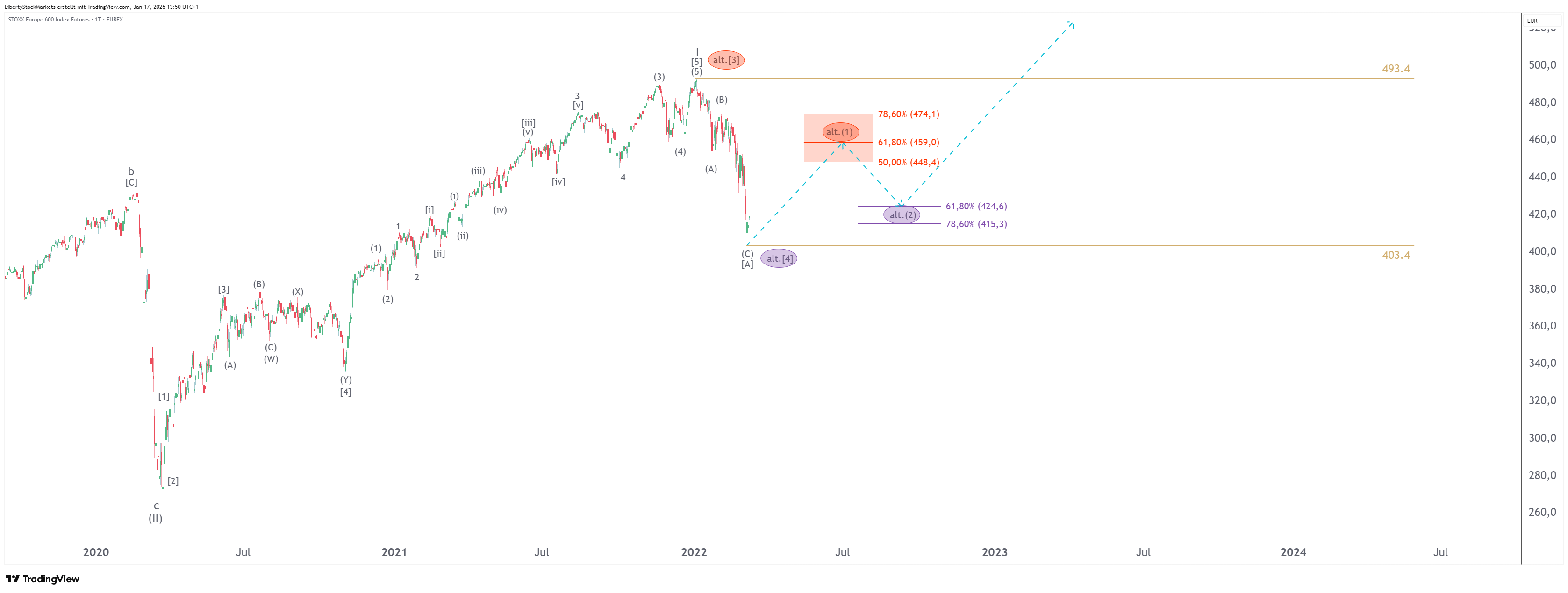
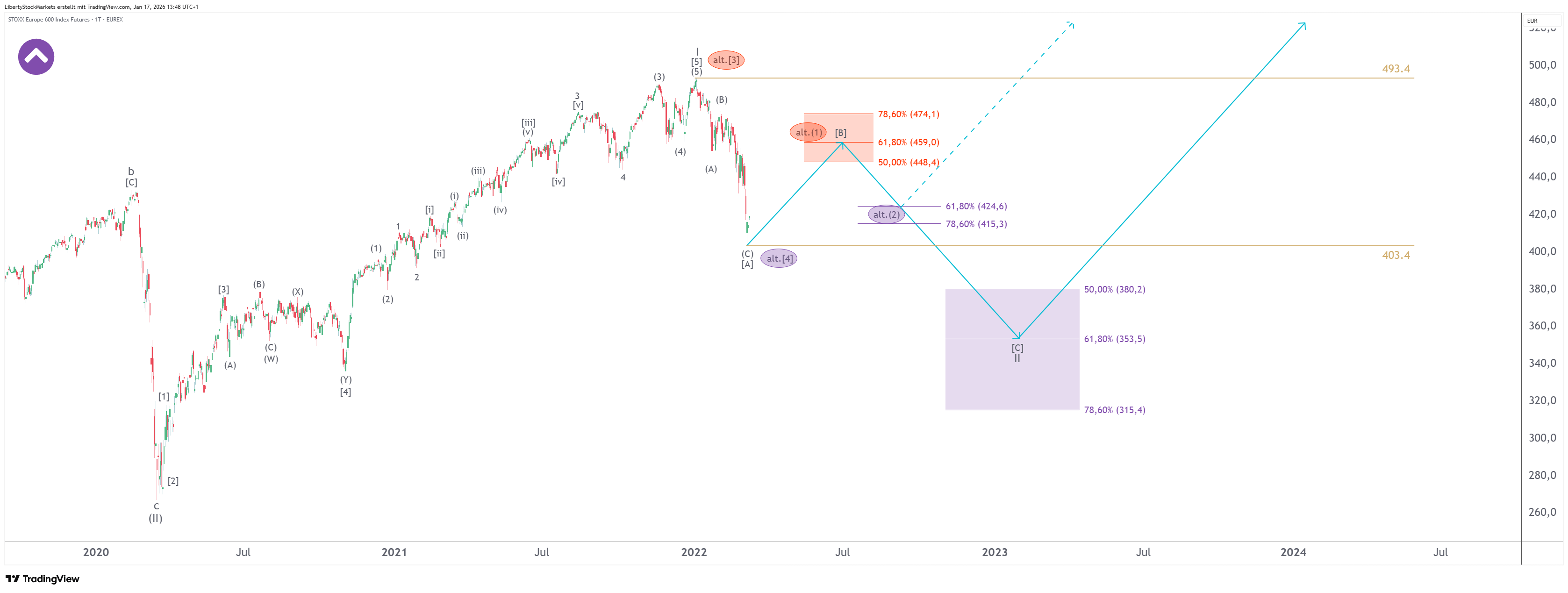
Here you can see how a “normal chart” turns into an actionable plan:
Forecast, alternative, and execution plan — built on clear scenarios, target zones, and triggers.

Forecasts are not guarantees. You get structured scenarios so you can prepare decisions in advance.

In this sample forecast, you’ll see:

  • Scenario logic: forecast + alternative — not just an opinion

  • Trigger levels: confirmation / invalidation — when a scenario becomes active (and when it doesn’t)

  • Target zones: clearly defined objectives — plus consequences (“What does this mean now?”)

How a chart becomes a plan — in 6 steps.

You don’t see the “perfect entry.” You see a structure designed to prevent costly mistakes.

First, you see price action alone — then structure, wave logic, scenarios, and finally a concrete execution plan.

  • 1 1
  • 2 2
  • 3 3
  • 4 4
  • 5 5
  • 6 6

Without our method

Without our method, you only see the price movement. In the next steps, this is gradually transformed into a decision framework: scenario, target zones, triggers — plus an alternative.

What are candlestick charts?

Candlesticks show price movement in defined time intervals (e.g. 1 day, 4 hours, 1 week).
Each candle summarizes what happened during that period — and many candles together form the chart structure.

A candlestick consists of open, high, low, and close:

  • Green: the closing price is above the opening price

  • Red: the closing price is below the opening price

This allows you to recognize direction and momentum at a glance — the foundation for structure, scenarios, and target zones.

Now price action becomes structure.

We apply our methodology to the price chart and make visible what the market is likely preparing — and what it is not.

The core idea

Prices do not move randomly — they follow recurring patterns driven by expectations, emotions, and behavior.

The foundation is an advanced interpretation of Elliott Wave logic, used as a framework to structure market dynamics.

Our method translates these patterns into a clear decision structure,
so you don’t have to guess at the moment of action — you can decide.

  • Markets leave patterns in the chart

  • These patterns follow recurring relationships

  • From this, scenarios, target zones, and clear alternatives emerge

We derive the most likely next move.

The blue arrows indicate the direction and expected sequenceas a scenario, not a promise.

From structure to target zones — so you know where decisions are made.

We translate price movements into mathematical relationships
and derive target zones from them: objectives, potential turning points, and risk areas.

The colored boxes

Red target zones mark areas on the upside where the market typically reacts —
often zones for profits, partial exits, or risk reduction.

Purple target zones mark areas on the downside where a correction may end —
often zones for entries or add-on positions.

What matters is not the color — but the logic behind it:
You get target zones and a Plan B, instead of hope and improvisation.

Alternative route

Plan A is not enough — that’s why there is always a Plan B.
For every market situation, we define an alternative scenario in case the primary scenario fails.

In this example, the alternative is shown as a dashed route (“alt.”).

Arrows and lines

Dashed arrows indicate the alternative route —
used if the primary scenario is invalidated.

Circles mark relevant turning points within an alternative route.

Horizontal lines are key levels: areas that either confirm or break a scenario.
This turns “gut feeling” into a clear if–then framework.

This is where the complete action plan comes together.

We combine the primary scenario and the alternative into a single chart —
so that in the moment of truth you don’t have to guess, but clearly know which path is active.

You don’t just see what could happen —
you also see what it means if it happens.

Trend wedges

The wedge in the upper-left corner of the chart shows the direction of the dominant trend:

  • Upward wedge (purple): rising primary trend

  • Downward wedge (red): declining primary trend

This allows you to immediately see whether you are working with the market — or against it.

Forecast Packages & Updates.

Now that you understand the logic, repetition is what matters in real markets. That’s exactly why Liberty offers forecasts and updates. Choose the package that fits your focus — the decision framework remains the same across all plans: forecast, alternative, target zones, and triggers. From STANDARD onward, you receive push updates for new forecasts and portfolio actions. For portfolio actions, you’ll also receive an email notification with full documentation.

BASIC

ETFs & Indices

STANDARD

ETFs & Indices

Stocks

Push updates

Notifications for portfolio actions

PROFESSIO­NAL

Extended ETFs & Indices

Extended stock universe

Cryptocurrencies

Commodities

Push updates

Notifications for portfolio actions